
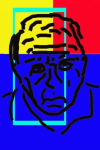
Color Field #4 – Oil on Wood
What is Color Field Painting?
Color Field painting, a derivative of Abstract Expressionism, is essentially the attention to color in abstraction as opposed to form or structure. The early Color Field painters, such as Mark Rothko, Clement Greenberg, and Clyfford Still created large works such that when one was standing up close one was absorbed in the color. Color Field has developed since then with various tendencies moving both further from shape and form and closer to it.
What I’m Doing
I’m developing color field in a way that combats the color against the figure. I’ll be doing so this year mostly at a residency at Contemporary Arts International with an exhibit following in November. This is not easy to do. First and foremost I need to have worthy figures that can both compete with the color but not overtake it. I do this by developing minimalist charcoal drawings, and the ones that work get transferred to paintings. But that’s not all that’s difficult. Color Field requires the fluid consistency of color, and the more colors that are added the more they must contrast and compliment each other at the same time. Make one mistake, and you’ve lost that jarring awakeness, so to speak.
Color Field is Not Easy
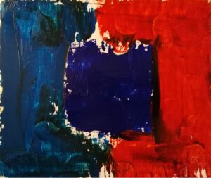
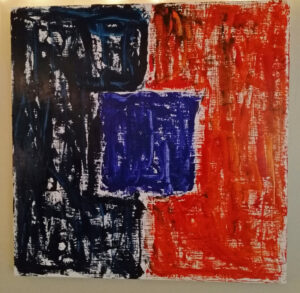
So it’s important to note that while creating one of these paintings is actually technically easy to do, what is difficult is the discovery and development of the painting. Many studies are done before a piece is finally ready to be painted on the final support. For example, Color Field #4 (noted above) is the study for A Blue Window, the latter of which is almost 3.5 times larger than the smaller version. Below are a couple of “failed” studies, too. Again, once the paint is done, there’s no going back, so one needs to be right before going in.
It’s the same with Jackson Pollock‘s streams of paint. Those look completely random (while Color Field tends to look quite prepared – a stunning contrast of the diversity of Abstract Expressionism), but Pollock did a lot of studying to prepare for his final pieces. These paintings are anything but random. Neither are these paintings that focus on the color. So I have actually four steps:
- Find the right color combinations;
- Develop good minimalist images;
- Discover which images go best with which colors;
- Pay close attention to all previous studies when creating the final piece (and hope nothing goes wrong!)
We’ll see how this develops and if the idea sticks in the exhibit later this year.
-
- A Blue Window
-
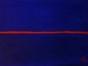
- Dusk – Oil on Paper
-

- Color Field Study #1 – Oil on Wood
-
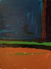
- Color Field Study #2
-
- Digital Study Color Field Rogerio
-
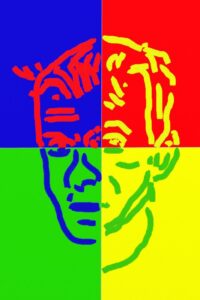
- Digital Study Color Field Chris